Aparato is a motion design and animation studio based in Uruguay. Over the years, the company has earned several international awards for VFX and have worked on a permanent basis with production houses and agencies in Mexico, Colombia, Peru, Ecuador, Chile, Paraguay, the United States, England, Spain, and China on brands including Coca-Cola, Amex, Movistar, Pepsi, AMPM, and Nestle. This design company also did the title sequence for the 2013 reboot Evil Dead.
Filmograph, previously known as Becker Design, is a studio focused on design, live action direction, animation, and entertainment branding for film and television. Founded in 2012 by Aaron Becker, the company specializes in feature film main title design. They have worked on such films as Insidious, Sinister, The Purge, Snitch, and The Conjuring. The studio’s television portfolio includes Bad Robot's Alcatraz and HBO's Clear History.
Imaginary Forces is a design-based production studio with offices in Hollywood and New York. Their award-winning work includes main titles, feature marketing, experience design, branding, commercial advertising, and interactive design. Founded in 1996, Imaginary Forces has created the main titles for films and broadcast titles such as Se7en, Mission Impossible, Mad Men, Boardwalk Empire, all three Transformers films, 500 Days of Summer, and others.
Tuesday, 25 March 2014
Saturday, 22 March 2014
Friday, 21 March 2014

Evaluation Question 4
This evaluation question was designed and answered by Cam Grant, who I worked with in the production of this opening title sequence.

Evaluation Question 2
How Does Your Media Product Represent Particular Social Groups?
Within our film there are only two characters. These characters are both white males, which shows a lack of representation for gender and different ethnic groups. However this was not a deliberate choice to do this, it was simply a case of the actors that were available to us for scheduled filming where both white males. Class is not particularly represent in this film, however it does suggest that they could possibly be of the middle to upper classes, due to the fact that one of the characters is wearing suit trousers and a shirt and the other is dressed in a full suit and tie outfit. These costume design choices were not however intended to represent class as such, for example the purpose of the white shirt was that it would easily show up our fake blood but seeing as the other characters is dressed in a suit it could suggested that he is a sophisticated, wealthy murderer but the narrative of the story does little to really show this.
Below is a mood board which is a collection of inspiration and prop uses from our film.

Wednesday, 19 March 2014
Soundtrack- The Original Version
This is the soundtrack that was used for our opening title sequence. You may notice, if you've seen the film already, that the music here seems distinctly dissimilar to the actual soundtrack on the video. This is because this piece of music has not been reversed, which gives off the slow and dark sound your hear in the film. The only instrument in this piece is an electric guitar being played with minor distortion. The buzz from the amplifier can also be heard but this gives a greater effect in the reversed version of the soundtrack. This piece (non-reversed) is based off of The Last of Us soundtrack song titled home. A discussion of that song can be found on this blog.
Tuesday, 18 March 2014
Music Inspiration- Marilyn Manson and The Color Morale
The first song I have chosen to analyse is a song called Fill;Avoid by a band called The Color Morale. The sound of this song is almost but not quite identical to our own soundtrack for the opening sequence. Supporting a deep, mysterious electronic tone it instantly becomes haunting and captivating, digging into the soul. It also oddly enough sounds like something was recorded and then played in reverse like our own soundtrack however this cannot be said definitely. However midway through the film, there is a sudden switch, to which the electronic sounds dither away and are replaced with a slow piano progression, that is lighter and more happy, relieving the listener of the dark tones the song has before. The lyrics are also sung gently but with long notes at times.
The second song that inspired me was the more upbeat, gothic rock song Sweet Dreams (Are made of this) by Marilyn Manson. The song starts off with a ominous riff from the guitar and then the bass kicks in to add an extra depth and layer to the song. Then all of the instruments come together to play a loud and pounding pre-verse. The lyrics are sometimes whispered and lightly sung, but Manson's unique style means he switches between shouts at the more energetic moments to really get the listener going. This song is similar to some of the soundtrack themes found on the Resident Evil films. The style may not have fitted in perhaps as well as Fill;Avoid, due to the fact that the film is a lot slower paced than the song, however I feel it still would have been fairly dark.
Epic Game Music Inspiration: The Last of Us - Home
This a song titled Home, from the soundtrack of the video game, The Last of Us. This song is so, so haunting that it was an instant inspiration for me the first time I heard it. The song opens up by utilising slow deep strings to create a long and ghostly atmosphere. This carries on for about 40 seconds, in order to really drive home the ominous atmosphere created by the music. The sound of the electric guitar coming forward is light at first, but then goes much the same way as the deep bass strings, giving off a slightly unnerving final note. There is then the accompaniment of acoustic guitar that plays a gentle rhythm and lightens the mood slightly. The electric guitar comes in again over the acoustic rhythm adding depth and layers to the song. The electric guitar again briefly stops and moves more to the foreground letting the acoustic sounds breathe some life, before the electric guitar now partnered with a piano both come in for a soaring and spine tingling finale. This song forms a highly spooky and surreal atmosphere for three minutes which both haunts and scares the listener. Comparing this to the Leaving Earth song for Mass Effect 3, we can definitely say that this song is moodier and very dark, but with light tones to not make it too overbearing and depressing.
Production Company Logos
The logos down below are generally Horror themed logos or are related to other kinds of well known films. Whilst we have not been able to create an actual digital sequence we have taken colours, sounds or logo designs from these logos and put them together to help create our own logos.
This is a horror movie companies (Dragonsoldier Pictures) logo sequence.
Below is the Lionsgate and Twisted Pictures logo openings.
This is the Jerry Bruckheimer Intro logo sequence. This is also the inspiration for our Musketeer Entertainment Video.
This is a horror movie companies (Dragonsoldier Pictures) logo sequence.
Below is the Lionsgate and Twisted Pictures logo openings.
This is the Jerry Bruckheimer Intro logo sequence. This is also the inspiration for our Musketeer Entertainment Video.
Pictures of the Production

The picture to the left is of the possible props we were potentially going to use for our film. The props include a trench knife. An M4 Airsoft Rifle with fake bullets for ammunition and magazine holders. There is also camera bags and equipment on the table.

The picture to the left is a before image of the set before it was covered in fake blood. The tripod can be seen along with myself preparing the camcorder for some Behind the Scenes videos.

The picture to the left is of myself after I had finished shooting the scenes where I play the body of a murder victim. The blood had seeped through the shirt and made a nice, realistic blood wound effect. It was a shame we did not find that out sooner!


The picture to the left of the set with extra props and a puddle of fake blood on the floor.
Another picture of me and the bloodied shirt.
Evaluation Question 1
1. In what ways does your media product use, develop or challenge forms and conventions of real media products?
Firstly it is important to reiterate all of the inspiration we gathered and developed in making our opening sequence. This is important as it will allow me to compare our inspiration with what we actually produced, and highlight any challenges or similarities to the conventions of those TV dramas/films that inspired us.

Monday, 17 March 2014
Theatrical Poster Second Design, The Art of Evil
This is the second poster design for our short film opening sequence, The Art of Evil. The reason why we have done a second poster is because we designed the first as if we were advertising a fully financed and produced feature film. This poster however is more specific and relates solely to the two minutes we have filmed for our opening title sequence. The first change is to the title. A shadow has been added which helps to add a greater depth to the title. Secondly the font of the tag-line has been changed. It looks familiar to that of typewriter print, which could be suggestive that the film is set in a different period. The third and probably most notable change is to the protagonist on the front of the poster. In the first design he was wearing an assault rifle strapped around his back, but this was removed due to the fact that there is not an actually rifle in the film. This in turn drew more attention to the character and the handsaw weapon.

Wednesday, 12 March 2014
Analysis of Theatrical Film Posters
 Dead Man's Shoes
This is the theatrical poster in which we have taken the most inspiration from. The colour scheme is identical to ours, making the most of the colour red to make it bold and eye-catching, but also to imply the themes of our film e.g blood, death, danger, murder. We have used the silhouette effect on our own main character with him facing away from the reader, but we have removed any other features in the background, so as to draw more focus to the character and to make the poster more minimalist. Similarly we have differed the colour of the text, highlighting some words in white for specific effect.

Friday the 13th
There are some aspects from this poster that could have inspired us towards the final design of our own poster, mainly the position of the iconic villian (Jason Vorhees) in the centre holding a weapon. Again, similarly to the Dead Man's Shoes poster there is the use of red and white coloured text. The tag-line at the top of the poster is in white so it is visible against the black background, and the title of the film is in red, which is a major convention of the horror genre.

Thor
Whilst this poster for Thor is not relatable to our own poster it is interesting to note that it is almost nearly identical in its layout to the Friday the 13th poster. The tag-line is in white and is positioned at the top of the poster. The centre of the poster is then dominated by the films main protagonist, much like the Friday the 13th poster but much closer and bolder. This is probably because Thor is a superhero as opposed to a sinister killer like Jason Voorhees. The title Thor is in red text, which again makes the film's title eye-catching and powerful, and also shows that it does not have to be a colour limited to the convention of the horror genre.

Scott Pilgrim vs The World
Again much like the Thor poster, the genre for this film is not the same as our our films genre, but the layout and design of the poster is surprisingly similar to the one we have created for our own film. Firstly the red background is an obvious similarity, but it is effective due to it being an eye-catching colour and also supporting lots of suggestive themes such as blood, danger etc. Whilst they may not wholly apply to Scott Pilgrim they certainately apply to The Art of Evil. The main protagonist like Thor and Friday the 13th is again placed in the middle with the tag-line beneath him.
Tuesday, 11 March 2014
Theatrical Poster for The Art of Evil
This a theatrical poster for our media film, The Art of Evil. We have based our poster off of the Dead Man's Shoes poster which will be looked at in-depth in a later post. The way we designed this poster was as if we where promoting a full length feature film, based on our opening sequence, which explains why the man pictured has a rifle strapped to his back and is carrying a handsaw. Whilst none of these weapons are actually featured within our opening sequence, they are weapons that would likely be included had this have been a fully financed, studio backed production. However, we are currently in the process of creating a separate poster which is more tailored toward and based of off the two minutes we have actually filmed.

Sunday, 9 March 2014
Risk Assessment
In this post I will cover the potential risks posed to us a crew on set when making our opening sequence.
Overall there was a moderate to low risk of injury. The main factor that could have been a problem for us was the use of fake blood as puddles on the floor. The floor was covered in plastic sheeting which had been placed there to enhance the mise-en-scene and was also a nod towards the television show Dexter. The consistency of the blood was thin, which gave it the potential to become a slip hazard, although no injury/accident was caused to nay crew member whilst on set.
The room was vey cold as it was a garage so it is plausible to say that there was a weather hazard. We had to wrap up to stay warm.
The only other risk we faced whilst filming was keeping the equipment safe. We made sure that the camera was attached safely to its tripod before filming and constantly found the right angles to film for the best and safest shots available to us.
The Final Cut... With Analysis
This is the final cut of our opening title sequence. The editing stage was completed on the 4th March 2014. The film is called The Art of Evil.
When looking back on the film there are definitely features that I would have liked to have been able to have performed better. The first would be the micro-aspect of cinematography. Whilst there are a lot of fantastic shots in this film, there are however a lot of shots that were unfortunately, too shaky and not stable enough. Audiences told us that this detracted from certain shots that needed to be stable as they contained important bits of narrative that were detracted from by the shaky camera. Another aspect I would have liked to have cleaned up and developed a little bit more was the soundtrack. Although we stumbled upon a gem by putting the soundtrack I created in reverse, it was still a little fuzzy. Static sound was overpowering and present in the background which I felt at times drew attention away from the film and more important bits in the music.
Wednesday, 5 March 2014
Budget
The budget for our opening sequence was relatively low and had this have been a feature film would have been considered a micro-budget. The only cost came in buying materials to make the fake blood; costumes and props had already been accounted for, including filming equipment.
Sainsbury's Shopping List
Lyle's 454g Maple Syrup x2 = £2.30
Red Food Colouring 38ml x1 = £1.00
Blue Food Colouring 38ml x1 = £1.00
Yellow Food Colouring 38ml x1 = £1.00
Corn Flour 500g = £1.20
Additional Items
Masks x5 = £10
Plastic Sheeting x2 = £12
Total: £28.50
If this were to be a fully financed feature film then it is hugely likely that the budget would be much greater. Paid actors, higher end recording equipment, would all be factors in adding up to a much larger budget.
Firstly in our opening sequence there is a scene where blood is chucked against a wall. The end result is a great, slow-motion image of the blood being splattered around on the wall, however due to the equipment we had available to us we were not able to film a completely smooth image. In the final edit of the film the scene suffers from frame rate drop, causing it to look slightly jittery and jumpy, but this is not such a major error that required it to be removed. It is for this reason why a high speed camera would be used in order to film the sequence, had this have been a feature film with a production companies backing. The scene would need to be filmed at around 60-120-fps in order to achieve a smooth slow-motion sequence.

Pictured below is a Sony PMW-350K XDCAM Camcorder. This camera costs £11799.95 which is approximately 414x more expensive than the total budget we spent on the actual production of our film. Seeing as this would be a 'low budget' production it is unlikely that the budget would be that of Iron Man 3 or Star Trek, both of which support $140-$200million budgets. A more likely budget would be perhaps around the $10-20million mark, but that would be if we were sponsored by an american production company otherwise we would have more of a British independent budget of around £400,000-£1million. Additionally it is unlikely that we would have an A-list star as part of the cast and would instead have unknown or lesser known actors. This means the budget would stay low and affordable.
Tuesday, 4 March 2014
Saturday, 1 March 2014
Psycho Shower Scene
This infamous scene from Alfred Hitchcock's Psycho is one the biggest inspirations for actions and pieces of cinematography within our opening sequence.
Firstly the genre of Psycho is a thriller, which is the genre we have chosen to base our film opening on. However as we can only show around two minutes, the genre could easily be perceived as more of a crime/drama film, and this would still be fairly accurate as their are strong influences within the opening from television shows like Dexter and Hannibal.
The second link between this particular scene and our media piece is the event that occurs within both pieces: a murder. However there are differences that help to separate the two films and make ours more unique and not a direct copy of Psycho. For example in our two minutes we focus more on the aftermath of the murder, with our victim already dead on the floor with the blood splattered on the floor and the walls. Additionally there is a greater interest in the actions of the killer, who we use to tease the audience, by not wholly revealing his identity but also try and cause discomfort to the audience by the twisted acts he commits.
 There are however some similarities between the two pieces. There are two obvious examples of things we have adopted and developed from the shower scene, the first being the close up on Marion's (played by Janet Leigh) hand as she drags it down the wall in her dying moments. In our opening the killer drags a bloodied have from left to right across a wall, scratching his nails for added intensity. The second example is a piece of editing and cinematography used within the shower scene. When Marion falls to the floor of the bathroom, the camera tracks the blood in the bath being washed into the sink. As it moves towards the drain, the water makes the swirling action as it falls. The film then dissolves to show an extreme close-up of Marion's eye, with the camera rotating to mimic the movement of the water going down the drain. This is a match on action edit and is also a technique we have tried to use, and we did this by pulling the camera back from what was initially an extreme close up, and then dissolving into the killer swirling a jar of blood, with the camera positioned underneath.
Above is the water and blood running into the drain. Below is a visual example of the cinematography used on Marion's eye. The picture on the left is roughly where shot starts and then the end shot is shown on the right.


Wednesday, 26 February 2014
Film Logos: Final Versions

The first logo for our opening title sequence is the 'Nevermore Productions' logo featuring a Raven. The inspiration for the name came from my Xbox Live Gamertag, which is actually 'Nevxrmore'- notice the x? We felt that this would be fitting for our film as the definition of nevermore is; never again or never again in the future. This relates perfectly to our film opening which has a dead body as one of its main focus points. The inspiration comes from the American author and founder of the Gothic Romanticist movement of literature, Edgar Allen Poe, who is often associated with a Raven. The design of the logo is relatively simple, effectively utilising contrasting colours (black on white and vice versa) to make the image clear and interesting. The use of red for the word 'Production' is to add more colour to the logo and make it look more eye-catching and sinister. The genre of the film which is a mystery, thriller, crime, drama accompanies the graphology and overall theme of the logo.
The 'Musketeer Entertainment' logo is a reference to the nickname of our production team which includes Cam Grant, Joe Howse and myself. This one is even more simpler than the previous one, but the intent is to just create a simple but effective logo that will fit the tone of the beginning of the film. Red text helps to be bold and add some colour to the hand drawn images of the swords, but not being to overpowering that it completely detracts from anything else in the logo.
When the logos will be added into the opening sequence they will be accompanied by sound effects. The 'Nevermore Productions' logo will have a roll of thunder and then a loud lightning crack over the top, whilst the 'Musketeer Entertainment' logo will be supported by the sliding, scratch over swords.

Thursday, 20 February 2014
Wednesday, 19 February 2014
The Script: The Art of Evil
SCRIPT
THE ART OF EVIL
WRITTEN BY PHIL CULLEN, JOE HOWSE, CAM GRANT.
ACT 1, SCENE 1: THE GARAGE
THE OPENING SCENE OPENS UP WITH A BLURRY IMAGE OF A WHITE BACKGROUND. GRADUALLY FOCUSING INTO VIEW, THE CAMERA WILL TRACK TO THE LEFT AND EVENTUALLY, THE FOOT OF A DEAD BODY WILL COME INTO SHOT. THE CAMERA WILL BE CONSTANTLY CLOSE UP TO OBJECTS AND CHARACTERS, SO AS NOT TO REVEAL TOO MUCH OF THE SETTING AND OF THE CHARACTERS WITHIN THE SCENE. WHEN THE SHOT OF THE FOOT IS FINISHED AND THE CAMERA NEARS THE SHIN AND KNEEE AREAS, INSTEAD OF CONTINUING UP TO THE REST OF THE BODY, THE FILM WILL INSTEAD CUT TO THE KILLER OF OUR STORY STEPPING INTO A PUDDLE OF BLOOD ON THE FLOOR NEAR THE BODY. AFTER THIS, THE CAMERA WILL CONTINUE TO PAN UP THE BODY, REVEALING BLOOD STAINED CLOTHING AND PATCHES OF BLOOD DRIPPING FROM THE BODY. WHEN THE HANDS OF THE BODY ARE IN SHOT, THE MURDERER WILL PLACE HAS HANDS INTO THE PUDDLE OF BLOOD, CUPPING A HANDFUL OF IT UP AND THE PRECEEDING TO SMEAR AND SCRATCH HIS BLODDIED HANDS ALONG A WALL. THE CAMERA WILL CONTINUE TO MOVE FURTHER UP THE BODY AND AGAIN A CUT WILL BE MADE FROM THE CHEST OF THE BODY TO THE KILLER, WHO IS NOW DRESSING HIMSELF IN A SUIT AND TIE. THE KILLER IS ALSO WEARING A MASK, WHICH INITIALLY IS NOT WHOLLY SHOWN. THE SHOULDERS OF THE VICTIM WILL BE SHOWN AND THEN THE KILLER SWINGING A JACKET ON AND TILTING HIS HEAD TOWARDS THE CAMERA. BY THIS TIME THE CAMERA WILL HAVE REACHED THE TOP OF THE BODY AND IN THIS SHOT, THE CAMERA WILL PULL BACKWARDS, WITH AN EYE OF THE VICTIM CENTRE TO THE SHOT. THIS WILL BE A RELATIVELY LENGTHY SHOT IN ORDER TO CREATE A SINISTER ATMOSPHERE. A MID SHOT OF THE KILLER FULLY DRESSED AND WITH THE MASK IN FULL VIEW WILL HAVE HIS HEAD TILTED DOWN AT THE CAMERA AND THEN RAISE IT UP TO LOOK DIRECTLY AHEAD AT THE CAMERA. THE FINAL SHOT WILL BE OF THE KILLER STIRIING A JAR OF BLOOD WITH A PAINT BRUSH. THE TITLE OF THE FILM WILL APPEAR OVER THIS BEFORE THE FILM FADES OR CUTS STARIGHT TO BLACK.
Tuesday, 11 February 2014
The Production Team
The production team consists of all of the roles that a team of people will undertake when making a film. Discussed in further depth in a previous post these occupations include director, cinematographer, editor etc. This post will make clear who within the group will conduct what role:
Director: Joe
Producers: Cam, Joe and Phil
Cinematographer: Joe
Screenplay: Cam, Joe, Phil
Editors: Phil (Main), Cam (Secondary)
Soundtrack/Composer: Phil
Starring: Phil, (The body), Cam (Killer)
Meet the team: Joe Howse (Left), Phil Cullen (Centre), and Cam Grant (Right).


Director: Joe
Producers: Cam, Joe and Phil
Cinematographer: Joe
Screenplay: Cam, Joe, Phil
Editors: Phil (Main), Cam (Secondary)
Soundtrack/Composer: Phil
Starring: Phil, (The body), Cam (Killer)
Meet the team: Joe Howse (Left), Phil Cullen (Centre), and Cam Grant (Right).
Monday, 10 February 2014
Shooting Schedule
Cam, Joe and I will all be present to film on those dates with Cam and I doing the acting pieces and Joe behind the camera shooting the film. We hope to film in one day specifically between 11:00am and 5:00pm. The clock is ticking...

Friday, 7 February 2014
Dexter and Hannibal opening title
I have chosen to analyze these two title opening sequences from Dexter and Hannibal as I have taken inspiration from both pieces.
Firstly Hannibal is the main inspiration for the use of the colours White and Red. The colour white is the main background for the titles creating a vast, open atmosphere which is the setting for the swirling formation of Hannibal's head which is aptly made out of blood. It creates a dark, moody atmosphere that focuses on our twisted villian. The titles appear around the mass of morphing blood, clearly and are easily visible against the white background.
Dexter is used in a similar fashion also with a heavy focus on the colour red. The whole of the opening credits in Dexter are filmed with extreme close-ups and close-ups, showing the detail on Dexter's 'Morning Routine'. Blood is a large element of the titles and the show itself which is why it relates heavily to our own project, which involves a long and lengthy pan of a dead body in a constant close-up. The idea of filming it in this way is so that the audience is drawn into the sequence to see the bloody detail in all its gruesome glory.
Wednesday, 5 February 2014
The Cast
A Victim/Dead Body: Played by me! Yeah I get the part of the dead guy which I have to say is pretty cool. There won't be much acting involved but hey that suits me as I'm definitely not an actor. There won't be any backstory to the death; the audience won't get to see it happen nor will a name be revealed. This should hope to add a strong mystery to the opening sequence and create a tense atmosphere. The position of the body will be laying directly on the floor facing up towards the ceiling. The body of the victim will be shown very clearly throughout with the camera doing a slow track up the body showing the feet, knees, waist, chest, hands, neck and then finally finish with an extreme-close up of the eye with which the camera will then rotate to create a swirling action, which will in turn dissolve and cause a match-on-action into the image of the jar of blood being mixed around. The victim will be dressed in either a white top or a shirt and either black trousers or jeans. Blood smears will be mainly on the white shirt/top to make it standout more.
The Killer/Murderer: Played by Cam Grant! The character played by Cam will not be given an identity. His face will never be shown, again to give mystery to the story and make his character quite intimidating. The killer will be shown kneeling in a pool of blood and placing his hands down into it which will then be smeared onto a wall in a lengthy and gruesome manner. As the camera tracks the body the killer will be dressing himself. When the camera reaches the point of the neck for instance the killer will be shown to tighten up a tie and put on a jacket etc. The only real feature of the killer that will be suggested as to why he is committing these murders is because he sees killing as an art form, much like the psychos in the Following which our own character is moderately based off. A strong piece of mise-en-scene to show this will be a jar/paint pot of blood which the killer will swirl around menacingly and then possibly apply to the dead body.

The Killer/Murderer: Played by Cam Grant! The character played by Cam will not be given an identity. His face will never be shown, again to give mystery to the story and make his character quite intimidating. The killer will be shown kneeling in a pool of blood and placing his hands down into it which will then be smeared onto a wall in a lengthy and gruesome manner. As the camera tracks the body the killer will be dressing himself. When the camera reaches the point of the neck for instance the killer will be shown to tighten up a tie and put on a jacket etc. The only real feature of the killer that will be suggested as to why he is committing these murders is because he sees killing as an art form, much like the psychos in the Following which our own character is moderately based off. A strong piece of mise-en-scene to show this will be a jar/paint pot of blood which the killer will swirl around menacingly and then possibly apply to the dead body.
Tuesday, 4 February 2014

Sunday, 2 February 2014
The Following TV Series
The Following is an American Crime/Drama that's follows the character of Ryan Hardy (Kevin Bacon) an FBI agent who must track down and find a brilliant but psychotic serial killer named Joe Carroll Killer (James Purefoy).

A creepy but fascinating aspect of the serial killer Joe Carroll is his obsession with Edgar Allen Poe, an American author, poet and literary critic who is considered to be a part of the American Romantic Movement. His stories also include the themes of mystery and the macabre with the latter proving to be too big an inspiration for Joe Carroll who developed a cult based on the idea that death was somehow beautiful. This weird obsession with death and Carroll's 'followers' infatuation with his own failed novel The Gothic Sea lead to a string of frightening and bloody murders with the killers often wearing face masks of Edgar Allen Poe or even Carroll himself. The victims are often posed by their killers, often with the purpose of conveying a personal message or as a sign or tribute to Poe's work.
The posing of the bodies and the killers wearing masks is a key piece of mise-en-scene that will likely be incorporated into our own opening sequence. A current idea for our opening sequence is the killer placing a mask over his victim after having posed the body into a piece of art.
The Following is currently my favourite show on television however there are other Crime/Dramas which I like such as Hannibal and Dexter, which each have gruesome and weird murders occurring and deeply complex, mentally unstable or stable characters. I will also be doing a future post on inspiration I have taken from Hannibal.
Saturday, 1 February 2014
Taken
Summary
Taken is a 2008 action thriller directed by Pierre Morel and starring Liam Neeson. Neeson plays a retired CIA agent who travels across Europe and relies on his old skills and work colleagues to save his estranged daughter, who has been kidnapped while on a trip to Paris.
Analysis of Narrative Structure
Taken is different to the other films I have previously looked at as this is the first one that is not a psychological thriller. Whilst Memento may not quite be a psychological thriller it still has main protagonist who faces a mental challenge. Taken is in fact an action thriller so its narrative structure may differ from the previous films I have talked about. Liam Neeson's character Bryan Mills faces the possible death of his daughter and so takes it upon himself to crusade around Europe in an explosive effort to find her. The people who have kidnapped Mills daughter could be seen as being stronger forces than Mills and whilst they initially have the upper hand of being able to threaten him with his daughters death, they are unaware that he is CIA trained which makes him a considerably more powerful threat to his daughters kidnappers. The main storyline is very much a character that Mills cannot and will not give up on. The mystery in this film is simply Mills daughters location and who her kidnapper are although the action in the film overshadows this and dispels the idea of the film being a 'mystery thriller'. The story is dominated from Mills point of view however their are parts when we see it from the daughters situation. Justice is a key theme although I feel that innocence is not really developed and perhaps can be applied by individual viewers. There is a mental battle between the protagonist and the antagonist, they each try to get inside each others heads to scare them off however most of the battle is between Mills and the antagonists various henchman and bad guys.
Character Study: Bryan Mills
Bryan Mills is a retired badass and simply a man on a mission to protect what he holds dear to him. He is portrayed at the start of the film as being perhaps overly protective of his daughter but the crusade he mounts to find her is just a show of his love for his daughter. He is quietly menacing throughout the film, except when he's beating up bad guys. He could be compared to John McClane from the Die Hard series, fighting to save his wife in the first film and his son in the fifth.
Memento
Summary
Memento is a mystery thriller directed by Christopher Nolan, starring Guy Pearce and Carrie-Ann Moss. Guy Pearce plays leonard a man suffering from short-term memory loss who uses notes and tattoos to hunt for the man he thinks killed his wife. The film was released on the 20th October 2000.
Analysis of Narrative Structure
At the start of the film our main protagonist has faced the death of his wife or rather the murder of his wife. The audience does not see the death but we know that it has happened recently in Leonard's past. The basis for the plot involves Leonard trying to find out who actually murdered his wife. This is very similar to the character of Teddy Daniels from Shutter Island who has also suffered from the death of his wife and is trying to solve her murder. Both of these characters are very strong individuals that share this vulnerable and emotional trait. There is an antagonist at the start of the film who Leonard strongly believes is his wife's murderer however Carrie-Ann Moss's character has a surprising twist that may cause the audience to have second thoughts. These two antagonists are initially stronger and cleverer than our protagonist. Leonard's quest involves him tracking down his wife's killer which is definitely a mystery and is all focused from his point of view. There is a strong element of justice in Memento as Leonard wants to avenge his wife's killer and there is a moral sense between some of the characters he meets and the person he believes to be the killer. The whole film is a complete mental challenge, as Leonard has severe short term memory loss which could potentially hinder his progress had he not have found a formula to document his case.
Character Study: Leonard
Leonard is a determined character who is set on his mission to get revenge and closure on the murder of his wife. The fact that he forgets things in a mere 5 to 15 minutes makes the story a tough one to keep up with from the audiences perspective, not to mention how stressful it must be for Leonard having to tattoo and write down all of the information he discovers and then piece it all together when he cant even remember where or when he procured it. It is exciting to watch as bit by bit Leonard does manage to get closer and closer to the truth, but the twists and turns keep the audience and Leonard himself one step behind the final answer.
Tuesday, 28 January 2014
Thursday, 23 January 2014
Black Swan
Summary
Black Swan is a psychological thriller film directed by Darren Aronofsky and starring Natalie Portman. The film was released on 17th December 2010. Natalie Portman plays ballet dancer Nina Sayers who wins the lead in "Swan Lake" and is perfect for the role of the delicate White Swan - Princess Odette. However she slowly begins to lose her mind as she becomes more and more like Odile, the Black Swan.
Analysis of Narrative Structure
At the start of the film we are in a state of equilibrium with our protagonist auditioning for the role of the play Swan Lake. She has not faced death or the death of another and comes across as a level headed individual who is passionate about her dancing. Nina auditions for the part of the White Swan, but doesn't get it easy due to her strict boss and the threat of another dancer named Lily who has a bolder more carefree attitude than that of Nina. It could be said that her boss and the other girl, Lily, are the strong forces or the antagonists that she must oppose. The quest that Nina is going through is defifnitely focused on a character however there isnt really a huge mystery to be solved. whilst there are events at the end of the film whih cause Nina to question herself, she is genreally focused on just learning and accurately portraying the White Swan for play. The narrative is from Nina's perspective certainately but the element of justice seems to be absent from this film however there are strong moral challenges and there is an overwhelming sense of innocence that envelopes Nina. At the films end Nina engages in a battle that reveals to be with herself, which is similar to the resolution in Shutter Island.
Character Study: Nina Sayers
Nina Sayers is an innocent young woman who just wants to be the perfect ballet dancer, pushing herself to the limit to achieve that goal. The revelation that her dance company will be performing Swan Lake is what drives Nina to to show off her her talent as the perfect dancer for the role of Princess Odette- the White Swan. Her relationship with the rebellious Lily causes her attitude to change, challenging her slightly possessive mother and exploring her sexual interests with Lily. This combined with her infatuation for the White Swan causes her to lose her innocence and slowly delve into the Black Swan. Nina changes from a caring, polite girl to a possessive and dark young woman.
Monday, 20 January 2014
Shutter Island
Summary
Shutter Island is a psychological thriller directed by Martin Scorsese and starring Leonardo DiCaprio. The film was released on February 19th 2010. Leonardo DeCaprio plays US Marshal Teddy Daniels who is assigned to investigate the disappearance of a patient from a Mental Institute on Shutter Island. But as Teddy delves deeper into the mystery the lines begin to blur and he starts to question his identity and sanity.
Analysis of Narrative Structure
Shutter Island in fact features all of the narrative features listed in my previous post on thriller films and their characters, making this film a perfect one to analyse when applying the narrative conventions.
From the very start of the film we are informed as an audience that Teddy has faced death, inn this case the death of another. Straight away this makes our protagonist vulnerable and is already at a disadvantage to any villains' or foes he may face. The opposing forces to Teddy are arguably stronger as they make him abide by the laws of the hospital and applying laws to him even though he is a law enforcement officer. Teddy follows a quest and is tasked with solving a mystery, which is indeed dominated by his point of view. As he is an agent for the law the idea of justice is obviously present and Teddy does indeed face moral challenges. There is an element of innocence for Teddy and the final battle does indeed end in him facing his enemy on a mental level.
Character Study: Teddy Daniels (SPOILERS)
Teddy Daniels is an interesting character and one that we initially feel comfortable and safe with as he is a US Marshal, a symbol standing for justice and ultimately 'good'. However as the mystery thickens Teddy begins to lose himself and the cracks start to show. We learn that the MacGuffin within the film this "patient 67" is actually Teddy himself and that the mental challenge and enemy he faces is really within his own mind. It is a clever twist and one that sees our hero actually become a man drowned in guilt and in denial of his criminal actions.
Psychology of Characters and Narrative Conventions
Characters in the thriller genre usually include criminals, stalkers, assassins, innocent victims (often on the run), menaced women, characters with deep dark pasts, psychotic individuals, spree killers, sociopaths, agents, terrorists, cops and escaped cons, private eyes, people involved in twisted relationships, world-weary men and women, psycho-fiends, and more. The themes frequently include terrorism, political conspiracy, pursuit, or romantic triangles leading to murder.
The protagonists are frequently ordinary citizens unaccustomed to danger, although commonly in crime thrillers, they may also be "hard men" accustomed to danger such as police officers and detectives. While protagonists of thrillers have traditionally been men, women lead characters are increasingly common.
Psychological Thriller
In psychological thrillers, the protagonists are reliant on their mental resources, whether it be by battling wits with the antagonist or by battling for equilibrium in the character's own mind. The suspense often comes from two or more characters preying upon one another's minds, either by playing deceptive games with the other or by merely trying to demolish the other's mental state.
The Primary Elements of the Thriller Genre
- The protagonist(s) faces death, either his and/or her or somebody else's.
- The force(s) of the antagonist's must initially be cleverer and/or stronger than the protagonist's.
- The main storyline for the protagonist is either a quest or a character that cannot be put down.
- The main plotline focuses on a mystery that must be solved.
- The film's narrative construction is dominated by the protagonist's point of view.
- The two major themes that underpin the thriller genre are the desire for justice and the morality of individuals.
- One small, but significant, aspect of a thriller is the presence of innocence in what is seen as an essentially corrupt world.
- The protagonist(s) and antagonist(s) may battle, themselves and each other, not just on a physical level, but on a mental one as well.
Monday, 6 January 2014
REC Discussion
REC is a 2007 spanish horror film. It is filmed in a P.O.V (Point of View) style that seems to be a popular style that has been adopted by many contemporary horror films. The film has two sequels and a fourth film which will be released later this year.
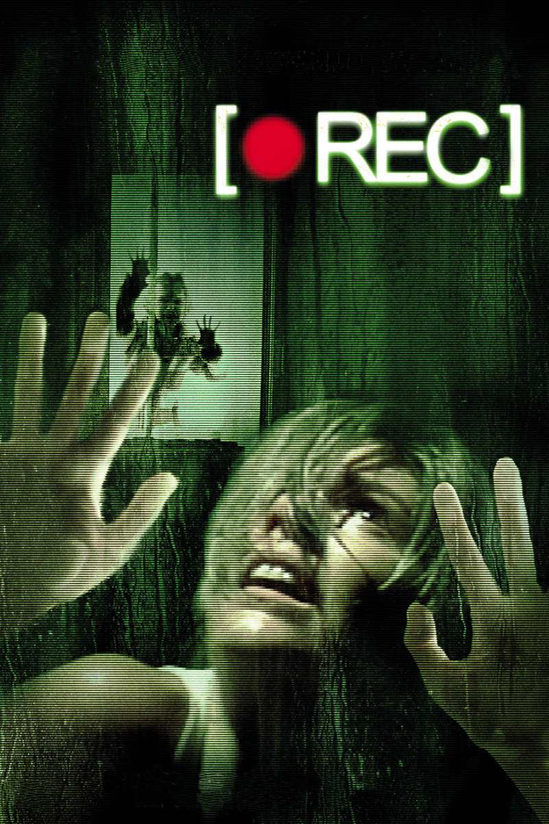 Firstly I would like to say that REC is a great horror film, that is quite truly terrifying. For a zombie film it is set on a fairly small scale, utilising only an apartment block as its set, but this is in fact one of the key aspects that actually makes the film scary and feel somewhat realistic. This feature in it self could be a convention of the horror genre as it brings in the key conventions of isolation and tight claustrophobic areas. The point of view from the cameraman (who is called Pablo but is only ever offscreen) makes the film unique in its style and often puts the audience at the front of the action, adding to the tension and atmosphere of the film. The scares with the exception of one are unexpected and shocking, not particuarly bloody, but terrifying enough to makeyou feel engaged and frightened out of your wits.
I look forward to seeing the following films in the series and hope that they follow a similar formula and style to the first. My genreal consensus is that REC is a zombie film that feels fresh and unique, and utilises powerful atmospehre combined with clever and skillful camerawork to create scares that do not feel cheap or tacky... well except one but it doesn't really change much.
Firstly I would like to say that REC is a great horror film, that is quite truly terrifying. For a zombie film it is set on a fairly small scale, utilising only an apartment block as its set, but this is in fact one of the key aspects that actually makes the film scary and feel somewhat realistic. This feature in it self could be a convention of the horror genre as it brings in the key conventions of isolation and tight claustrophobic areas. The point of view from the cameraman (who is called Pablo but is only ever offscreen) makes the film unique in its style and often puts the audience at the front of the action, adding to the tension and atmosphere of the film. The scares with the exception of one are unexpected and shocking, not particuarly bloody, but terrifying enough to makeyou feel engaged and frightened out of your wits. I look forward to seeing the following films in the series and hope that they follow a similar formula and style to the first. My genreal consensus is that REC is a zombie film that feels fresh and unique, and utilises powerful atmospehre combined with clever and skillful camerawork to create scares that do not feel cheap or tacky... well except one but it doesn't really change much.
Saturday, 4 January 2014
Descent: Part 2, Discussion and Comparison
As discussed in a previous blog, The Descent is a British horror film about a group of 6 friends who go down into an uncharted cave system only to find that the cave are home to a hive of bloodthirsty creatures. One by one they end up falling but not all by the monsters...
The Descent is probably one of my favourite films, especially in the horror genre, and the discovery that there was a second film was an interesting and exciting prospect. The first film ends with a shock and a neat twist that gets your brain turning and trying to make sense out of the events that just occurred. Hopes for the Descent Part 2 giving some more answers to the mystery set up by the first film were high, even though warnings given by an experienced and knowledgeable source said otherwise. Of course, curiosity got the best of me and I was greatly disappointed.
The film starts off a couple of days after the events of its predecessor with our surviving hero Sarah being plunged back into the caves she just escaped from, this time accompanied by a search and rescue team and some cops. They descend into the caves to look for Sarah's missing friends and find mixed results. Delving even deeper ends up getting with the group becoming separated and fighting for their lives against a returning enemy, one which Sarah is all too familiar with.
Positives. There are very few that I can take from this film, but the first is the creatures themselves. They still look as impressively frightening as they did in the first film, attacking their victims with the same ferocity as before. Whilst the scares that they try and pull on the audience are predictable and weak, their presence is the most welcome aspect of the film, teasing their victims at times and increasing the pace of the film. The other positive is linked with this strongly and it is the fight scenes between our human group and the underground creatures. The engagements are tight and fierce with the blood and gore effects being focused upon in close-up shots similar to the first film. This is nice as it shows a respect for the first films presentation in showing the fighting and the blood, which I liked.
Negatives. A huge factor that was completely missed form the Part 2 was the lighting. In the first film you had a strong focus on red lighting that made the settings look as if they had been bathed in blood, and in alternative parts there was a wash of green lighting. These colours made the film more intense and strangely beautiful and also strongly foreshadowed future events in the film. Additionally the ending scene is awash in a blue colour that gives a refreshing feel to the end of the film. This was not carried through to the second film, with the lighting looking flat and uninteresting. Pale yellows and faded brown is how the film settings looked and this on a personal level was highly disappointing. The scares too were also very predictable and felt rehashed form the first film, which made the film feel a little boring. Lastly and probably the most annoying thing, is the narrative of the film. It does little to give an explanation to the existence of the monsters and the big surprise could be seen form a mile away. The weird 'hallucination's' from the first film were not played upon in the second and this did not allow the audience to simply think or interpret Sarah's survival for ourselves. Females are strongly represented in this film which is great, however a new character faces exactly the same struggles that Sarah faces herself and is not really that interesting. Her own 'escape' is almost a complete copy of Sarah's, just filmed from the opposite side.
All in all the film looks dull and fails to really think of new ways to scare the audience. The story is simple and very uninteresting, with loads of opportunities to hint or suggest answers about the cave and monsters being missed. I would give this film a 4/10.
Subscribe to:
Posts (Atom)